
The UX Lessons I Learned from Fixing $10M Mistakes
Three recurring UX failures that waste time, money, and user trust, and the lessons teams should learn from them.
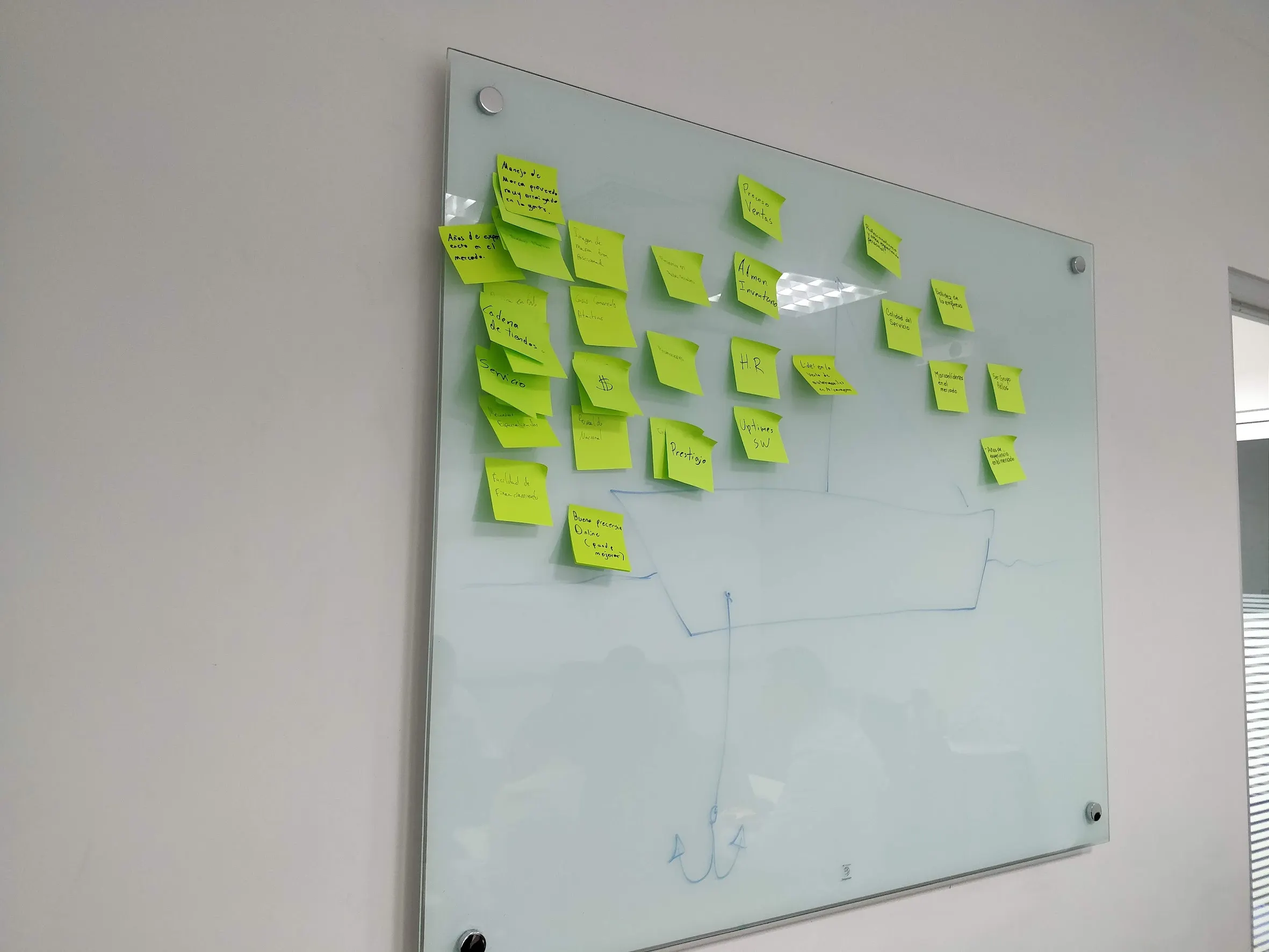
I wish I could say my UX career has been nothing but smooth sailing, full of sticky notes and perfectly aligned components. But nah. I’ve seen digital products bleed cash like a busted faucet. I’ve watched teams waste millions building features nobody wanted. And more than once, I’ve had to walk into a room, pull up sleeves that weren’t even rolled, and fix a mess so expensive that it could’ve paid for a yacht and a few therapy sessions.
Let me be clear: I’m not the hero of every story. But I’ve been in the trenches long enough to recognize one cold, hard truth:
Most $10M problems didn’t start with code. They started with ego.
Mistake #1: “We Already Know What the Users Want”
A bank client swore up and down they knew their customers. “We don’t need research,” the exec said, “we’ve got data.”
Sure you do. But raw data without context is like watching a surveillance tape with no sound. You can see the behavior, but you have no clue why it’s happening.
We eventually convinced them to run actual user interviews. Spoiler: users didn’t care about the new feature set the bank was spending millions on. They just wanted to see their balance faster and not get lost in seven layers of navigation.
UX lesson: Data without empathy leads to bloated nonsense. Talk to humans before you build for them.
Mistake #2: Designing in a Vacuum
This one came from a telco project. Beautiful screens. Smart flows. A team of super talented designers.
Problem? No one talked to engineering until week six. The result? A Frankenstein prototype full of magical thinking, built on assumptions that would’ve taken 12 months to implement, if the system even could support it.
UX lesson: Collaboration isn’t optional. Invite devs early or enjoy watching your vision burn.
Mistake #3: Skipping the Define Stage Because “We’re Agile”
Ah yes. The classic: “We’ll figure it out as we go.”
One retail platform burned through $700k in development before realizing they never aligned on the actual problem they were solving. One team thought it was about increasing upsell. Another thought it was about reducing cart abandonment. The result? A Frankenstein checkout flow that did neither.
UX lesson: Agile isn’t an excuse to skip strategy. Discover and Define aren’t fluff. They’re survival.
The Real Cost of UX Neglect
When people hear “bad UX,” they think of clunky buttons or ugly layouts. But the real cost? Misalignment, wrong assumptions, wasted cycles, and user trust that’s near impossible to win back.
I’ve sat across C-suites explaining why their app sucks. I’ve helped design teams rebuild trust after users revolted. I’ve coached PMs through the aftermath of rushed launches. And every time, it came down to this:
UX isn’t about making things pretty. It’s about making sure we don’t waste time, money, or people’s patience.
Final Thought
If you’re working on something important, and it’s costing real money, invest in UX like your bottom line depends on it. Because it does.
And if your gut says, “we’re moving too fast,” or “we’re skipping steps,” you’re probably right.
UX isn’t magic. But ignoring it is always expensive.